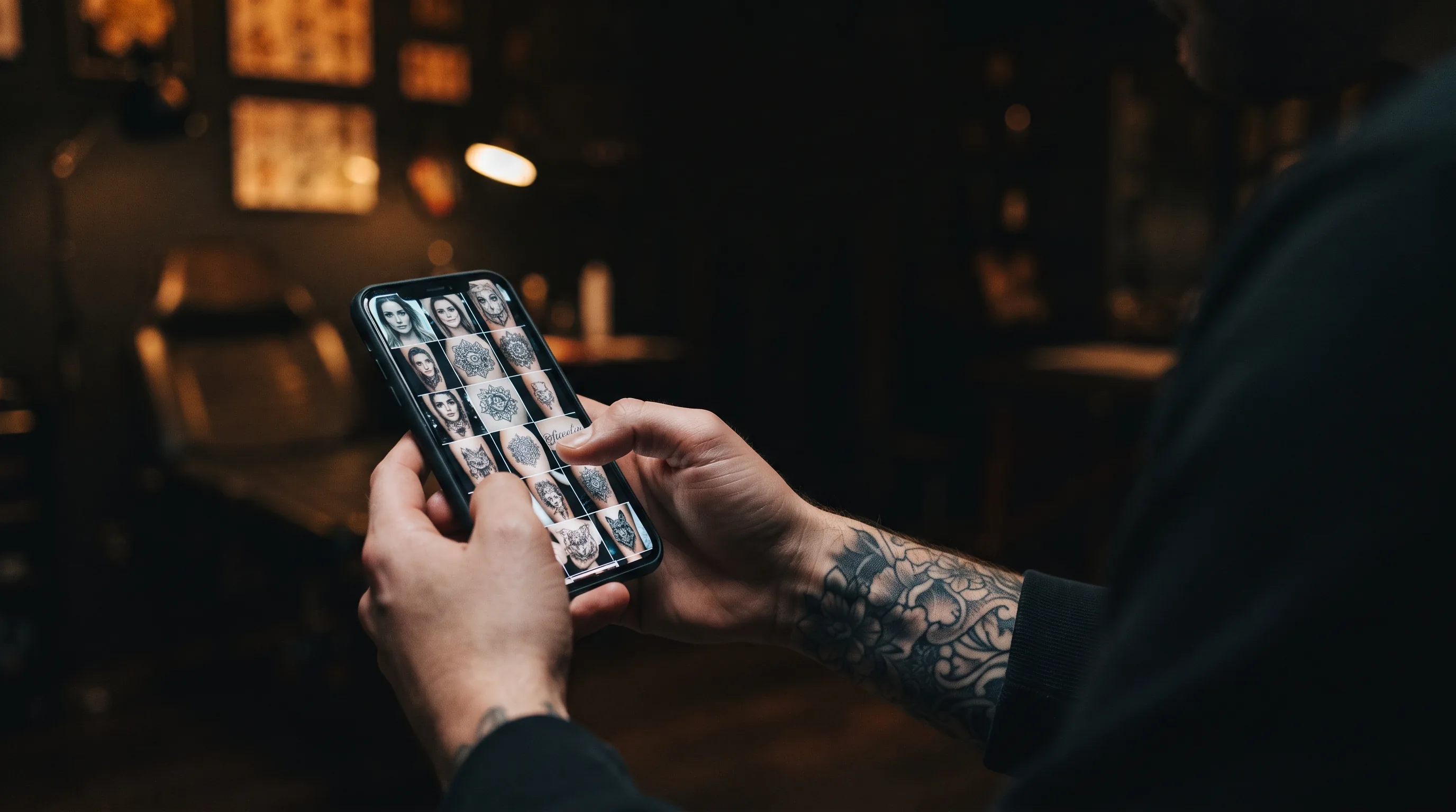
Everyone says the same thing when you ask how to pick a tattoo artist: look at their portfolio. Almost nobody explains what looking actually means. A portfolio is not a record of an artist's work — it is the thirty or forty images they chose out of several thousand tattoos, photographed at the best possible moment, in the best possible light, and edited before anyone saw them. That is not dishonest. It is what a portfolio is for. But it means the skill you need is not finding the portfolio, it is reading it, and reading it well takes about twenty minutes of knowing where to look.
This guide is the close-reading companion to our broader guide on how to find and choose a tattoo artist. That one covers where to look and what to ask. This one is about the photographs themselves.
The Photo Is an Argument, Not Evidence
Start from the right assumption: every image in a portfolio has been selected to persuade you. Four things are usually working in the tattoo's favour before you have looked at a single line.
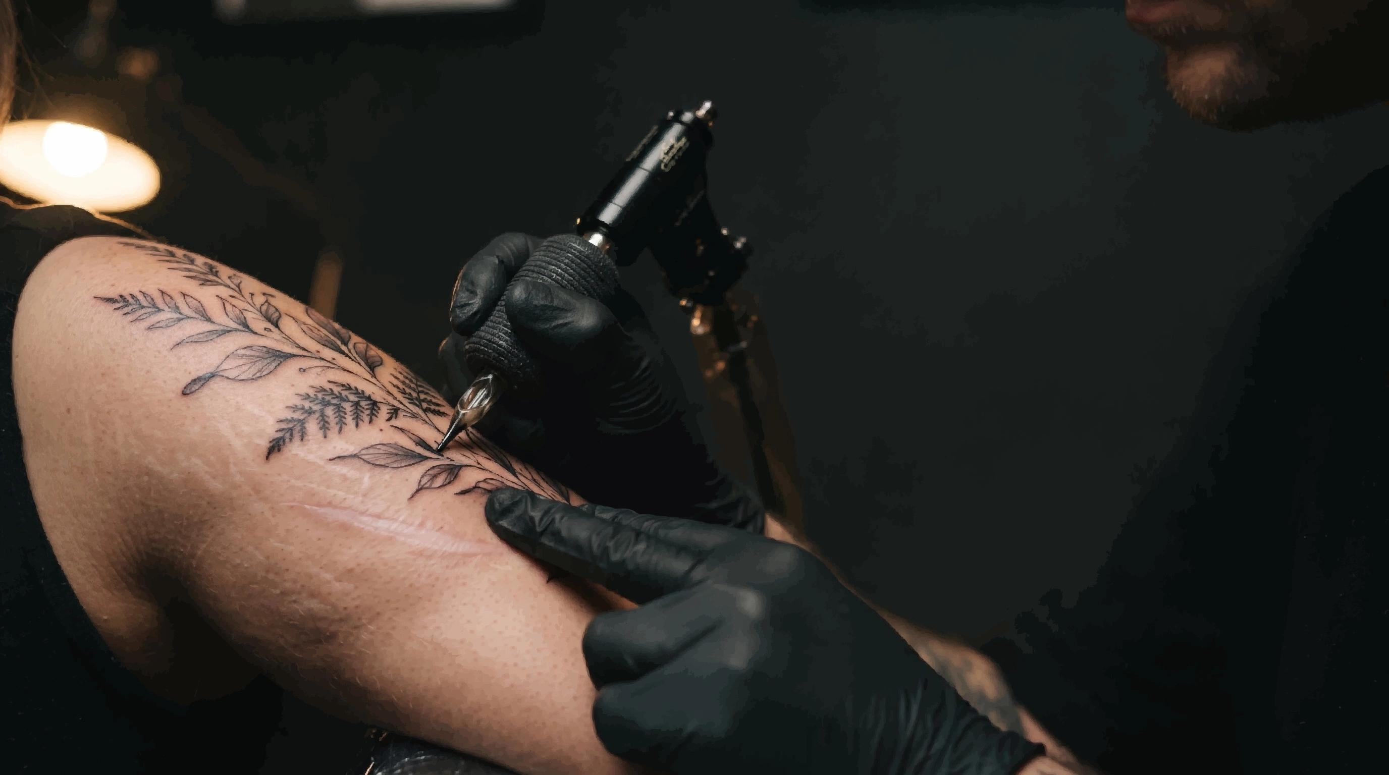
- It was shot minutes after the needle came out. A fresh tattoo is at its absolute peak — swollen, high-contrast, and coated in a thin film of ointment that makes black look blacker and colour look deeper. It will never look like that again.
- It was shot under studio light. A ring light or a direct flash flattens skin texture and hides small inconsistencies in shading and fill that daylight would show.
- It was edited. Contrast, sharpening, and saturation are near-universal in tattoo photography, and every one of them makes technical work look tighter than it is.
- It survived a cut. The pieces that did not go the way the artist hoped are not in the grid. Nobody posts their worst day, and you should not expect them to.
None of that makes a portfolio useless. It means you read it the way you would read any other piece of advertising — looking for what it is quietly not showing you.
Fresh Work Versus Healed Work
This is the single biggest distortion in tattoo photography, and the easiest one to correct for once you can see it. A fresh tattoo and the same tattoo at three months are genuinely different objects. Healing pushes a measurable amount of pigment out of the skin, lines soften as the surrounding tissue settles over them, and the top layer of skin you are eventually looking through slightly mutes everything underneath. The tattoo you are buying is the healed one.
How to spot a fresh photo
- A wet sheen. The whole area looks glossy or greasy from ointment, often with visible highlights where the light catches it.
- Redness at the edges. A pink or red halo a few millimetres outside the linework, and sometimes patchy blotching across the whole piece.
- Raised lines. If the linework casts a faint shadow or the skin looks slightly puffy along it, that is swelling, not ink.
- Stray ink or stencil residue. Smudges of loose pigment, or faint purple-blue stencil marks still on the skin nearby.
- Shaved skin. A hairless patch with a visible boundary around the tattoo.
How to spot a healed photo
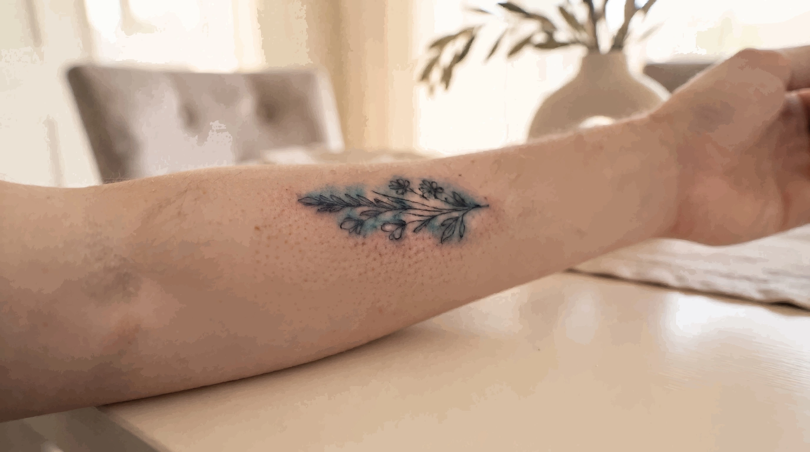
- Visible skin texture. You can see pores, fine lines, and normal skin grain running straight through the tattoo.
- Matte finish. No sheen. The tattooed skin reflects light the same way the skin beside it does.
- Regrown hair. Body hair growing normally through and around the piece.
- Softened line edges. Slightly less knife-sharp than a fresh line, and evenly so across the whole piece.
- Everyday light. Healed shots are often taken casually — at a convention, in a car, at a follow-up — rather than in the studio.
A portfolio with no healed work is not automatically a bad portfolio; healed photos are genuinely hard to get, because they require the client to come back or send one. But an artist who can produce several on request is showing you something a fresh photo cannot: that the work held. Look especially for healed examples of whatever is most fragile in your own piece — fine lines, small lettering, white highlights, or anything on hands and fingers, which are the hardest placements in tattooing to keep looking sharp.
Five Things to Look At in a Single Photo
Zoom in. Most portfolio images are posted at a resolution that survives a pinch, and almost everything worth knowing lives at that scale.
1. Line quality
Follow one long line from end to end. You are looking for a consistent weight along its length and a clean, decisive edge on both sides. Specific faults to watch for:
- Wobble — a line that ripples very slightly instead of running true, most visible on long curves and straights.
- Chicken scratch — a line that reads as several short overlapping strokes rather than one pass, often with thickened lumps where the passes meet.
- Blowout — a soft blue-grey haze bleeding just outside a line, where ink has spread into the wrong layer of skin. Our guide to tattoo blowouts covers what causes it; in a portfolio, a blowout is simply information about how tightly that artist works.
- Trailing ends — lines that taper unintentionally or fade out where the artist lifted off, rather than ending where the design ends.
2. Solid black
Areas of packed black are where technique is hardest to fake. A well-packed black field is flat and even, with a crisp boundary. Look for holidays — small light patches or streaks inside a black area where the fill did not take — and for any visible directional striping from the needle passes. Both are much clearer on healed photos than fresh ones, which is one reason black-heavy work is worth chasing healed examples for.
3. Shading and gradients
In black and grey, a smooth transition from dark to light should look continuous. Watch for banding, where the gradient steps between distinct tones instead of blending, and for muddiness, where the mid-tones lose separation and the shape stops reading. Compare the artist's darkest black against their lightest grey in the same piece: a wide, clean range is the mark of real control, and it is exactly what our guide to black and grey versus colour describes as the thing that carries a piece over the long term.
4. Colour
Saturation is the tell. Colour that is fully packed looks dense and uniform; colour that is under-worked looks slightly translucent, with skin tone showing through. Check the boundary between two colours, and between colour and black — a clean, deliberate edge is hard, and a smeared or muddy one is the first thing to get worse as the tattoo ages.
5. How it sits on the body
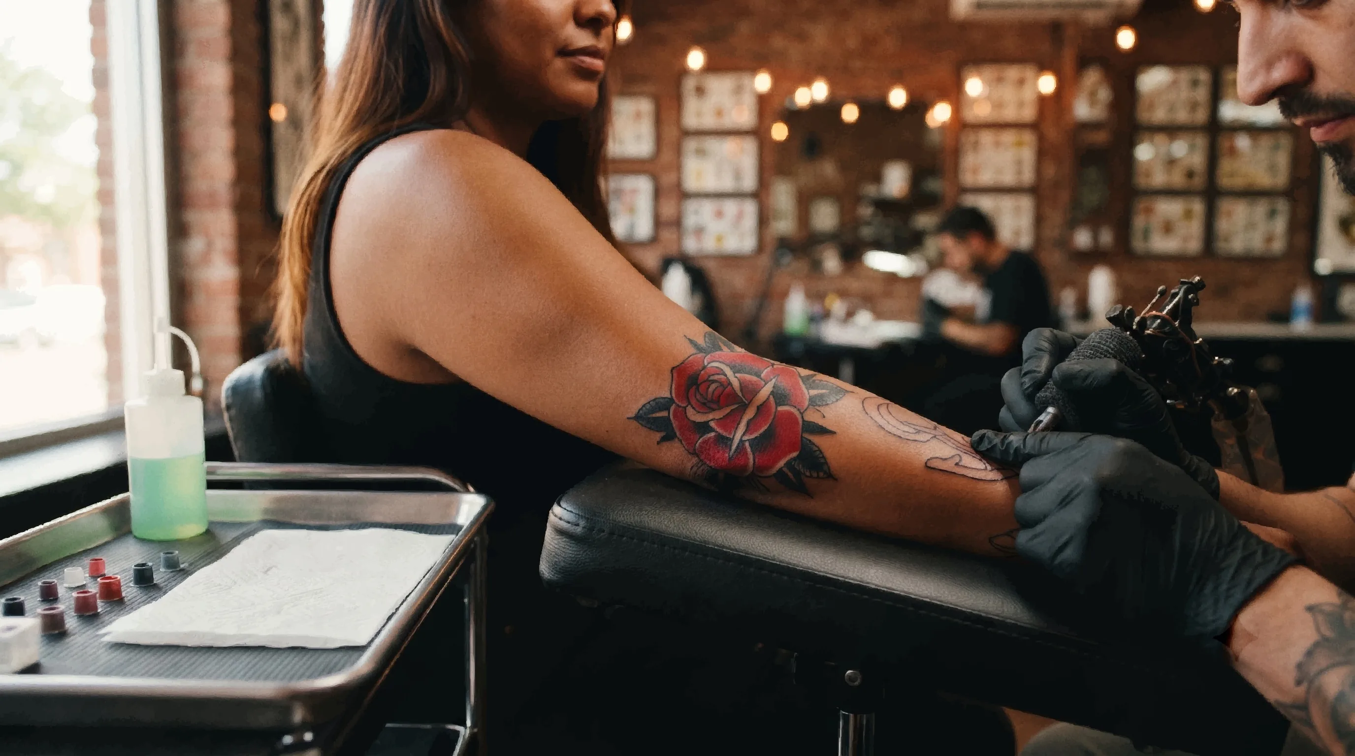
This is composition rather than technique, and it separates a good tattooer from a good draughtsman. Does the design follow the curve of the limb and the line of the muscle, or does it look like a flat sticker applied to a round surface? On a matched pair — both forearms, both sides of a chest or back — does the piece hold together across the centre line? And is the scale right for where it sits? Detail that is too fine for its placement is the most common way a beautiful design becomes a disappointing tattoo, because it is the first thing to blur as the ink settles. Our guide to preventing tattoo fading explains why detail below a certain size cannot be preserved by aftercare alone.
What Editing Hides
You do not need to be a photographer to read the photography. A handful of choices come up again and again, and each one conceals something specific.
- Heavy contrast and sharpening. Deepens black and hardens every edge in the frame. Its side effect is a giveaway: if the pores and hair around the tattoo also look unnaturally crisp, the linework has been sharpened along with them.
- Black-and-white conversion on a colour piece. Occasionally a style choice. Often it removes the evidence of uneven saturation or a muddy colour boundary. If an artist is selling colour work, you want to see colour photographs of it.
- Very tight crops. A close crop can be about detail, or it can be about keeping the rest of the piece — the join, the background, the placement — out of frame. Look for at least some images that show the whole tattoo on the whole body part.
- Extreme angles and deep shadow. A dramatic raking light looks great and hides flat areas of fill completely. Prefer the boring, evenly lit, straight-on shot when you are trying to judge quality.
- The ointment shot. Not a trick so much as a default, but worth naming: the gloss is doing a meaningful amount of the work in almost every fresh photo you will see.
Read the Portfolio as a Whole
Any artist can produce one exceptional piece. The portfolio-level questions are about pattern.
- Consistency beats peaks. Ten strong pieces in one style is a track record. One brilliant piece surrounded by ordinary ones tells you what their ceiling is, not what your tattoo will be.
- Range versus tourism. An artist who works in two or three related styles is versatile. An artist whose grid jumps between fine line, traditional, realism, and script with no through-line is usually taking whatever walks in, and rarely the best choice for any of them. Our guide to tattoo styles is a useful reference for telling which styles genuinely sit next to each other.
- Check the dates. Scroll back a year or two. Work that is improving is a good sign. A grid where the last four months are all small, quick pieces and the standout work is three years old is worth asking about.
- Watch for repeats. The same six tattoos reposted at different crops, in different filters, and as reels is a thin portfolio dressed as a full one.
- Scale. If you want a half sleeve, a grid of excellent palm-sized pieces does not answer your question. Large work demands planning, flow, and stamina that small work never tests.
- Follower count tells you nothing. It measures how well someone's work photographs and how often they post, both of which reward flat, graphic, high-contrast designs. Some of the best technicians in the industry have small accounts and full books.
Is the Work Actually Theirs?
Portfolio theft is rarer than the internet suggests, but it happens, and it is concentrated exactly where it does the most damage — new accounts and cheap rates. The signals are usually inconsistency rather than anything about the tattoos themselves.
- Mismatched photography. Different skin tones, lighting setups, backgrounds, and camera quality across pieces supposedly done in one studio.
- A sudden jump in quality with no gradual progression before it.
- No process content at all — no stencils, no in-progress shots, no hands, no shop, no clients. An artist who works every day generates this material without trying.
- Watermarks that appear, disappear, or sit oddly, including cropped corners where one used to be.
- Reverse image search. Save a suspicious photo and run it through Google Images or TinEye. It takes ten seconds and settles the question.
Reposting someone else's design is a separate issue from stealing their photo. If a piece in the grid is a well-known flash design or another artist's composition, the question to ask is whether it is credited — normal and common in tattooing — or presented as original.
Match the Portfolio to Your Tattoo
The last step is the one most people skip: a portfolio can be genuinely excellent and still be the wrong evidence for your specific piece. Before you book, check that it contains work that matches yours on all five of these.
- Style. Multiple strong examples in the style you actually want, not an adjacent one.
- Size. Pieces at roughly the scale of yours, ideally larger.
- Placement. Ribs, feet, hands, necks, and inner arms all behave differently under a needle. Work on your placement is worth more than work in your style on an easy one.
- Skin tone. Ink reads differently against different skin, and technique adapts accordingly. If you have deeper skin, look for healed work on deeper skin — our guide to tattoos on dark skin covers what to look for and what to ask.
- Colour or black and grey. Strength in one does not predict strength in the other.
Four Things Worth Asking to See
A good artist will not be offended by any of these, and the answer you get is as informative as the photos. Ask through their booking form or at the consultation, before any deposit changes hands, alongside the practical questions in our guide to preparing for your appointment.
- "Do you have a healed photo of this one?" The most valuable question in the list. Ask it about the specific piece that sold you.
- "Do you have anything at this size, on this part of the body?" Confirms the portfolio actually covers your job.
- "Is there a piece of yours you would show me at two or three years old?" Almost nobody asks, and the answer separates artists who stay in touch with their clients from those who do not.
- "Have you tattooed skin like mine in this style?" Direct, reasonable, and the fastest route to a realistic conversation about what the finished piece will look like.
When you are ready to start comparing, you can browse tattoo artists on Tattooed.co by style and location and read their galleries side by side with everything above in mind.
Reading a Tattoo Portfolio FAQ
How can you tell if a tattoo photo is healed or fresh?
Look at the skin rather than the tattoo. A fresh photo has a wet, glossy sheen from ointment, redness or blotching around the linework, slightly raised and swollen lines, a shaved patch with a visible boundary, and sometimes stray ink or faint purple stencil residue nearby. A healed photo is matte, shows normal pores and skin texture running through the tattoo, has hair growing back through it, and is usually shot in ordinary light rather than in the studio. Healed lines also look very slightly softer at the edges, evenly across the whole piece.
What does good line work actually look like in a photo?
Zoom in and follow one long line from end to end. It should hold the same weight along its length and have a clean, decisive edge on both sides. Faults to look for are a faint ripple instead of a true curve, a line that reads as several short overlapping strokes with lumps where they meet, a soft blue-grey haze bleeding just outside the line (a blowout), and ends that taper or fade where the artist lifted off rather than where the design finishes.
How many photos should a tattoo artist's portfolio have?
There is no threshold number, and volume is the wrong measure. What matters is whether there are several strong, distinct pieces in the style you want — not one standout surrounded by ordinary work, and not the same six tattoos reposted at different crops and filters. A focused portfolio of twenty genuinely different pieces in one style is far more useful than two hundred images spread across every style there is.
Is it a red flag if an artist only posts black and white photos of colour work?
It is worth asking about. Converting a colour tattoo to black and white removes the evidence of uneven saturation and muddy boundaries between colours, which are the two hardest things to judge in colour work and the first to get worse with age. It can be a deliberate style choice for a grid, but if someone is selling colour tattoos you should expect to see colour photographs of them, and a healed one if possible.
How do I know if a tattoo artist stole their portfolio photos?
Save a suspicious image and run it through Google Images or TinEye — it takes seconds and usually settles it. The surrounding signals are inconsistency rather than the tattoos themselves: different skin tones, lighting, backgrounds, and camera quality across work supposedly done in one studio; a sudden jump in quality with no progression before it; watermarks that appear and disappear or corners cropped where one used to be; and a complete absence of process content such as stencils, in-progress shots, or the shop itself.
Does a tattoo artist need to have tattooed my skin tone before?
For most work it is not a hard requirement, but it is genuinely useful evidence, and more so for colour, fine line, and white highlights. Ink reads differently against different skin and technique adapts accordingly, so healed examples on skin close to yours tell you far more about your likely result than fresh photos on anyone else's. Asking directly is normal and a good artist will answer it straightforwardly, including by telling you it is not their strength.