 Glitch Angel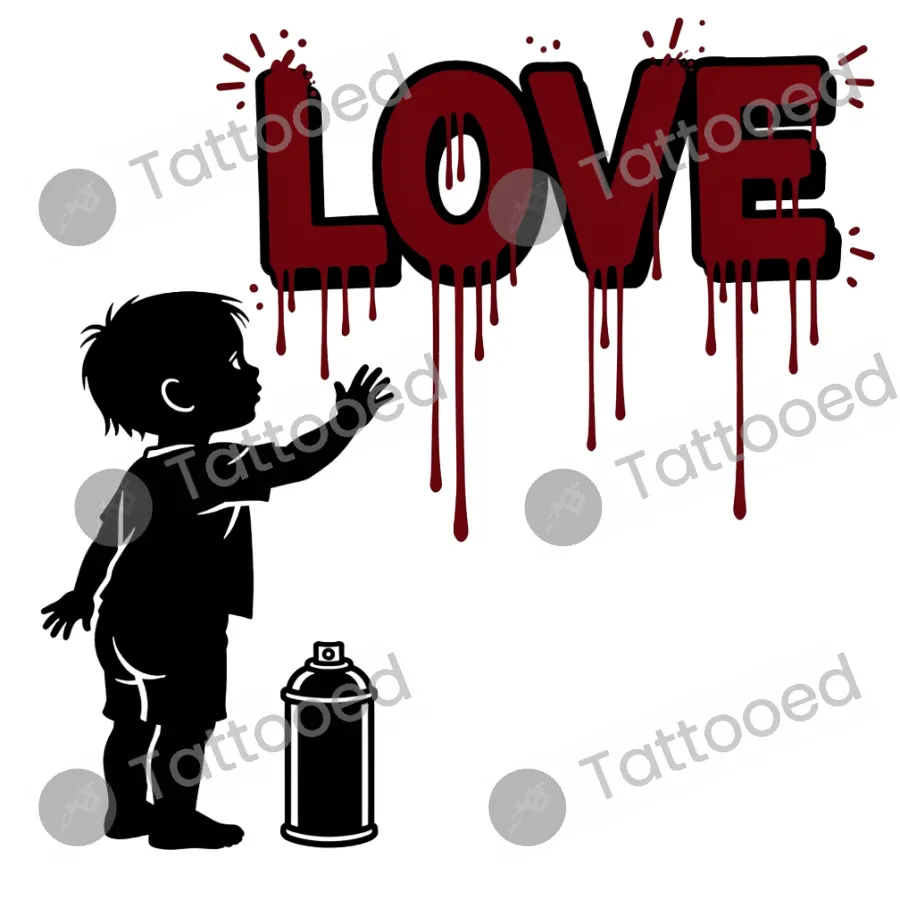
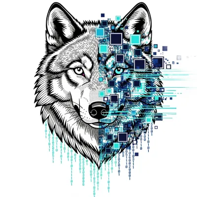 Digital Wolf Corruption
This design plays on the contrast between an innocent child figure and the dripping, almost aggressive lettering of "LOVE", styled after urban graffiti tagging. It reads as a comment on how love can be messy, vandalised, or forcibly declared rather than gentle, and the spray can grounds it in street art culture rather than romantic sentiment. People choose it to express a rebellious or bittersweet take on affection, or simply for the graffiti aesthetic itself.
Where it sits
The composition is wide and horizontal, with the child low on one side and the dripping text stretching across the top, making it suited to forearm, upper arm, ribcage or thigh where that width can be used. Shrinking it too much would lose the drip detail on the letters and flatten the child's silhouette into a blob, so it needs a reasonably long, flat stretch of skin. A back piece or full sleeve panel would let both elements breathe without cramping.
Making it yours
Ask an artist for any of these.