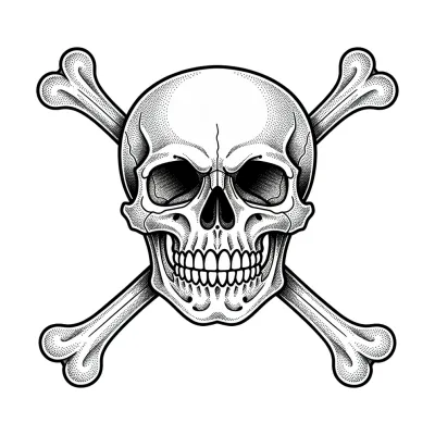
 Pirate Symbol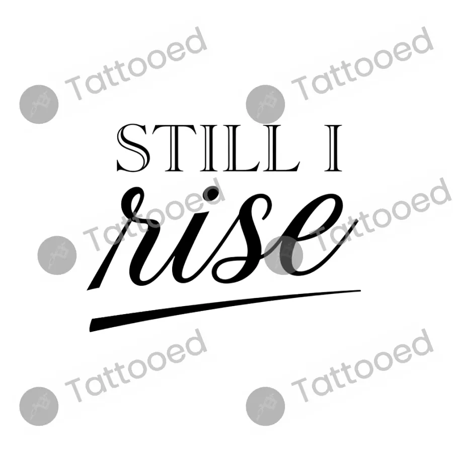
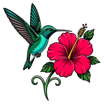 Hummingbird & Hibiscus
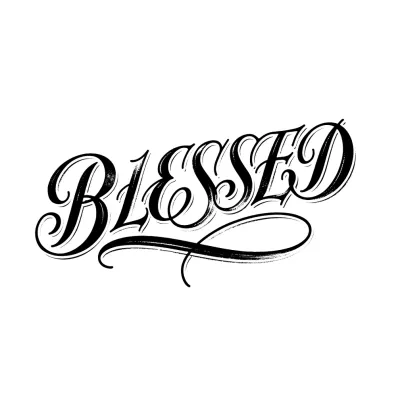
The phrase references Maya Angelou's poem of resilience and defiance in the face of adversity, widely adopted as a symbol of personal strength, survival and overcoming hardship. It resonates with people who have come through difficult periods such as illness, loss, or personal struggle. Some choose it purely for the aesthetic of the lettering without the literary reference in mind.
Where it sits
This is a wide horizontal composition with a strong baseline underscore, making it well suited to the forearm, ribcage, or across the upper back. The contrast between the serif capitals and the looping script needs enough width to read clearly, so it would lose definition if squeezed onto a narrow area like the wrist or ankle. The underline and the descending "r" and "s" strokes need a bit of vertical room too.
Making it yours
Ask an artist for any of these.