Lettering is one of the most requested tattoo types in any shop, and one of the most commonly regretted. A name, a quote, a date, a single word — lettering tattoos feel simple on the surface. They are not. The margin for error is enormous, the failure modes are predictable, and the people who end up unhappy almost always made the same avoidable mistakes. Here is how to get it right.
Why Lettering Tattoos Go Wrong
Before getting into styles and fonts, it is worth understanding why lettering fails — because it fails more often than almost any other tattoo category.
Blurring Over Time
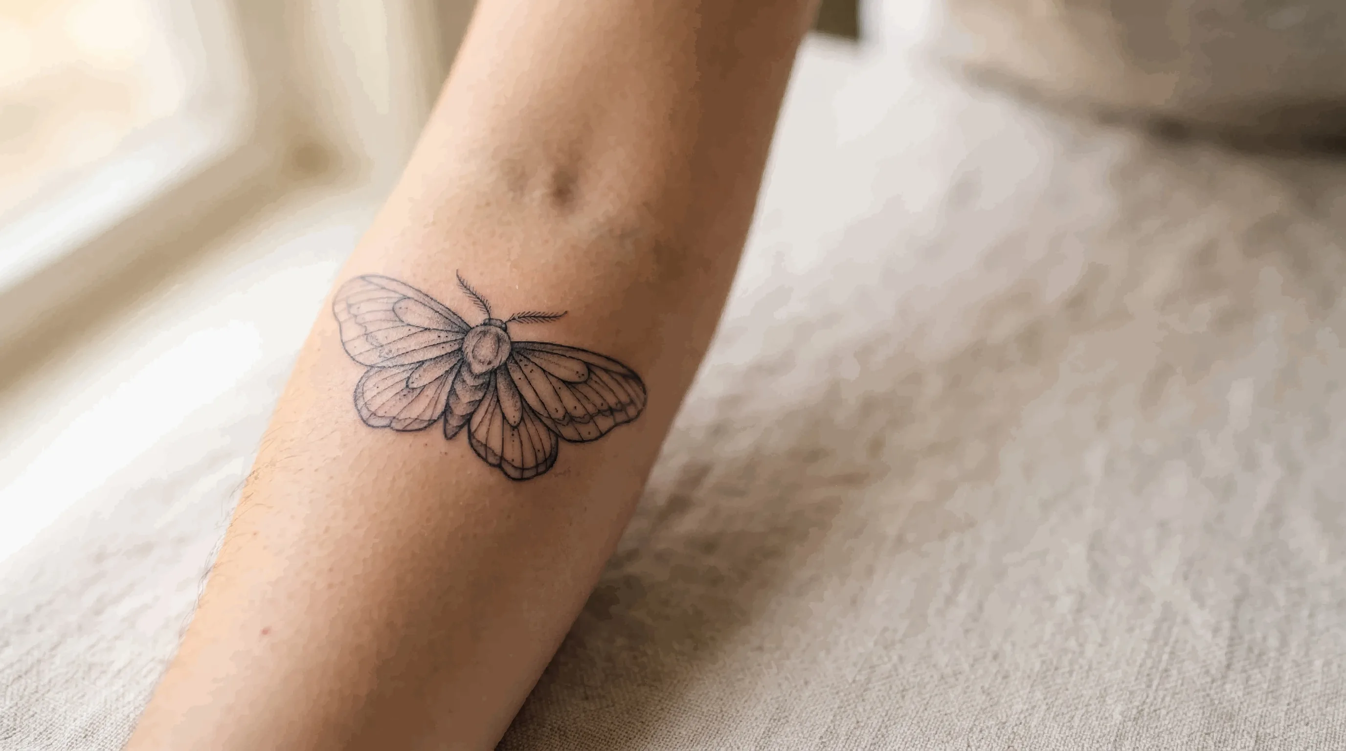
Ink in skin is not static. Over years, ink particles migrate slightly outward from the original line — a process often called blowout when it happens immediately, and spreading when it happens gradually over time. Fine, closely spaced lines are the most vulnerable. A delicate thin-stroked script that looks immaculate the day it heals can become an illegible smear within five to ten years if the lines were packed too tightly or tattooed too shallow.
This is why the tattoo community has a well-worn saying: go bold or go home. Thin ornate script that looks beautiful in a typed font does not necessarily translate well onto skin over a lifetime.
Poor Spacing and Sizing
Letters need breathing room. Script crammed into too small a space, or stretched across a placement that distorts when you move, loses legibility quickly. A quote that reads perfectly on a flat surface may buckle, warp, or separate when placed on a curved, mobile area of the body.
Wrong Artist for the Style
Lettering is a specialized discipline. Not every tattoo artist who produces excellent illustrative or realism work can execute clean, consistent script. Lettering requires its own training, eye, and technical precision — especially for flowing cursive styles where the spacing, slant, and stroke weight need to be perfectly consistent across every letter.
The Main Lettering Styles
Old English / Blackletter
Heavy, angular, and unmistakable. Old English — also called Gothic or Blackletter — features thick vertical strokes and thin diagonal hairlines with ornate serifs. It has deep roots in tattoo culture and is particularly associated with Chicano and traditional American styles.
It ages relatively well because the bold strokes hold their definition. The risk is readability — Old English is notoriously difficult to read at small sizes or when too many letters are placed in close succession. Keep it large enough for the letterforms to breathe, and avoid trying to fit entire sentences in this style.
Cursive / Script
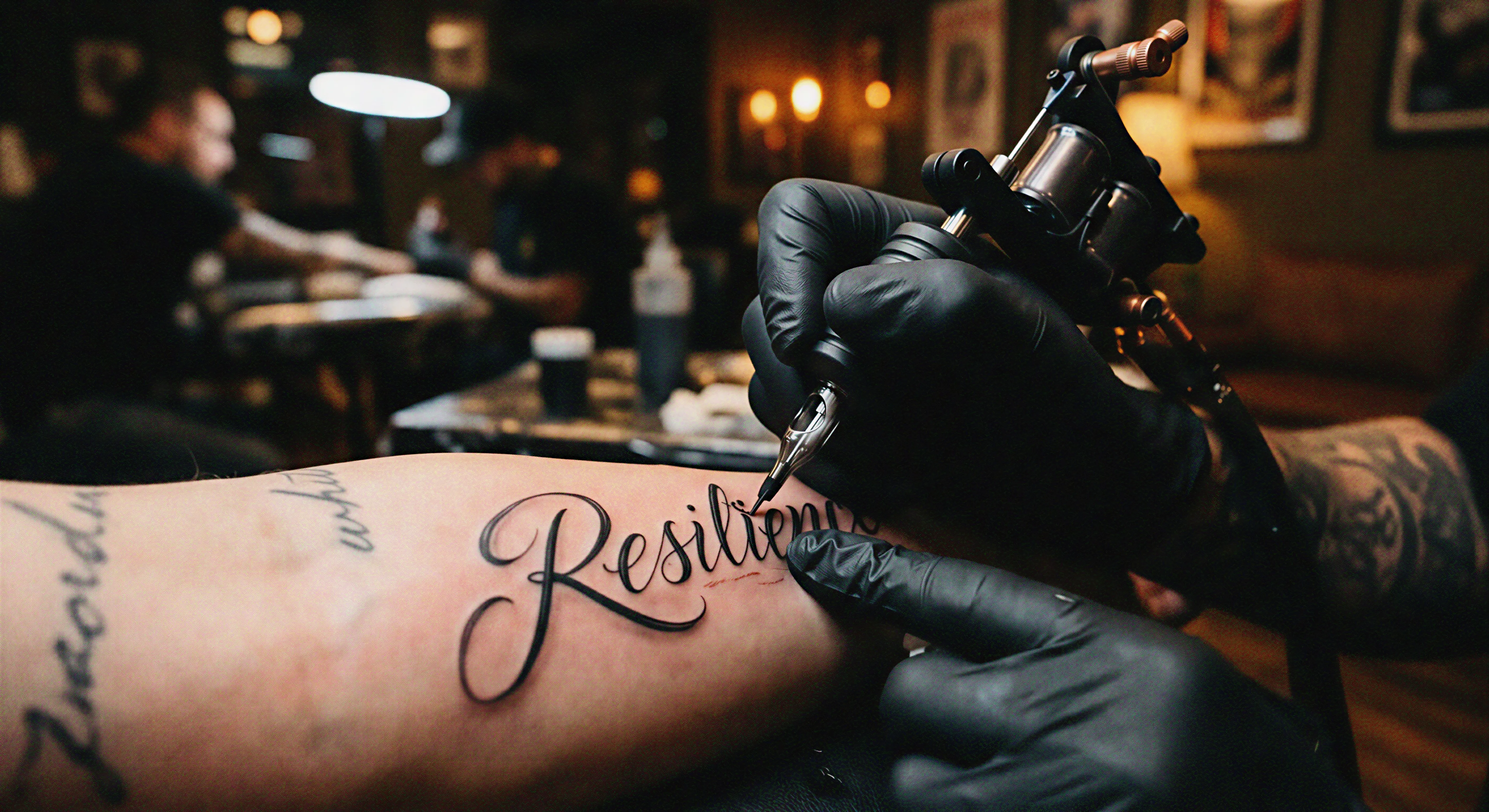
Flowing, connected lettering that mimics handwriting. This is by far the most popular lettering style in tattooing, and also the most technically demanding to execute well. The appeal is obvious — it is personal, elegant, and evocative of handwritten notes, signatures, and personal messages.
The problem is that bad cursive tattooing is instantly recognizable. Uneven stroke weight, inconsistent slant, and poor letter connections are extremely visible. When you see a quote tattoo that looks shaky or amateur, it is almost always cursive done by someone who was not genuinely skilled in script. Vet your artist specifically for this style — not just their overall portfolio, but their lettering work specifically.
Serif Fonts
Serifs are the small decorative strokes at the ends of letterforms — think Times New Roman or Garamond. Serif lettering tattoos have a classic, editorial quality and work well for names, dates, and short statements. They tend to age better than thin cursive because the letterforms are more defined and self-contained.
The main pitfall: the hairline serifs themselves can fade or blur over time if the artist uses a needle that is too fine or does not pack the ink with enough depth. Make sure your artist has experience with serif lettering specifically, not just block text.
Block / Sans-Serif
Clean, unadorned capital letters without decorative flourishes. Block lettering is the most legible and the most forgiving over time. What it lacks in personality it makes up for in durability — bold strokes hold for decades. It is a strong choice for single words, initials, or short phrases where clarity matters more than style.
Even block lettering requires attention to spacing and sizing. Inconsistent letter spacing (called kerning in typography) is the most common failure, and it is extremely noticeable. A good lettering artist will hand-draw the layout rather than simply stenciling a font they printed from a computer.
Brush Lettering
Brush lettering mimics the look of calligraphy made with a wide brush — thick downstrokes and thin upstrokes, with expressive variation in line weight. It sits somewhere between cursive and blackletter in terms of character and is currently popular for more modern, illustrative-influenced designs.
It requires an artist with strong calligraphy instincts. The variation in stroke weight that makes brush lettering beautiful is also what makes it difficult to execute consistently. Look for an artist who does this style regularly, not one who has done it once or twice.
Fine Line / Handwritten
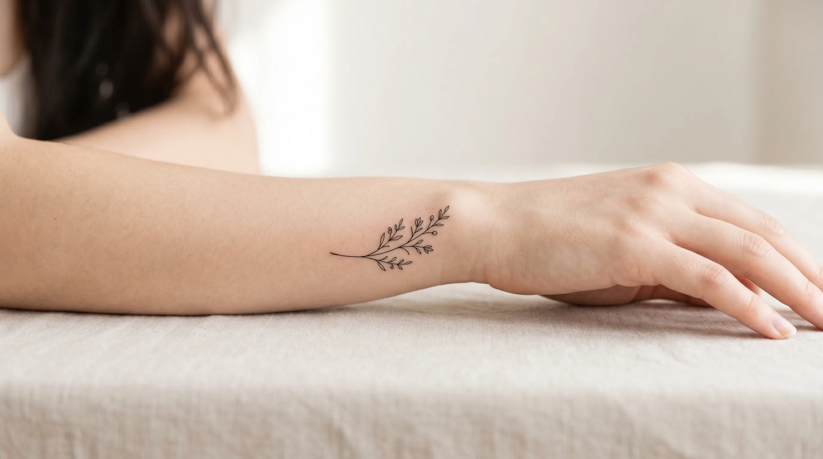
Delicate, lightweight lettering that mimics casual handwriting — sometimes an artist's own. This style is popular for intimate pieces: a loved one's signature, handwriting preserved from a letter or card, or a minimalist quote meant to feel understated.
This is the highest-risk lettering category for longevity. Thin strokes placed close together will blur. If you want this style, be realistic about what it will look like in fifteen years, choose a placement with minimal stretching and friction, and size it generously — the lines need space.
Placement Makes or Breaks a Lettering Tattoo
Text on skin is unforgiving of bad placement in a way that other tattoo types are not. A slightly imperfect flower still reads as a flower. A word that warps or shifts is immediately wrong.
Placements That Work Well
- Forearm (inner and outer): Flat, relatively stable, readable at a glance. One of the best placements for longer quotes or names.
- Upper arm / bicep: Good surface area, minimal distortion during normal movement.
- Chest: Works well for single words or short phrases centered on the sternum. Longer pieces across the chest require careful planning to account for curvature.
- Upper back: Excellent for longer text or banners. Flat surface, minimal movement distortion.
- Collarbone: Very popular. Works best with short text — one to three words. The arch of the bone actually helps the text follow a natural curve.
Placements to Approach Carefully
- Fingers and hands: Lettering fades and blurs faster here than almost anywhere else. The skin is thin, constantly exposed, and regenerates quickly. Finger tattoos often need frequent touch-ups to stay legible.
- Ribs: The curve of the ribcage and the movement of breathing can distort long horizontal runs of text. Short phrases or single words work; full sentences wrap awkwardly.
- Feet and ankles: High friction, thin skin, and a lot of movement. Fine script on the foot is a high-fade placement.
- Back of the neck / spine: Can look incredible when done right, but requires precision about alignment — even a small tilt is visible.
The Minimum Size Rule
There is no universal minimum, but experienced lettering artists work from a practical principle: every letter needs to be large enough for its thinnest stroke to hold over time. As a rough guide:
- Script and cursive letters should generally be at least 0.5 to 1 cm tall to hold their detail.
- Tightly spaced letters need more individual height, not less — the spacing compounds the blur risk.
- If an artist tells you the text you want is too small to execute the way you envision it, listen to them.
The most common mistake people make is insisting on text that is smaller than it should be because they think it will look more delicate or discreet. In ten years, "delicate" often becomes "illegible."
Choosing a Font or Lettering Style
Bringing a printed font as reference is fine — it tells the artist the general feel you want. But a good lettering artist will not simply stencil a computer font onto your skin. They will hand-draw it, adjusting for the scale, the placement, the natural curve of your body, and the specific demands of tattooing (line weights that hold, spacing that reads well). The font is a starting point, not the final artwork.
Things to communicate clearly:
- The exact text — every word, exactly as it should appear, including punctuation.
- The general style family (flowing script, bold blackletter, clean sans-serif, etc.).
- Whether you want all caps, mixed case, or a specific capitalization.
- Any font references — screenshots, Pinterest saves, photos of tattoos you admire.
- Whether you want embellishments like flourishes, underlines, banners, or decorative borders.
Common Mistakes to Avoid
Trusting a Non-Specialist
Lettering is its own skill set. An artist with a spectacular portfolio of floral work or geometric designs is not automatically qualified to produce clean script. Ask specifically for their lettering work. If they cannot show you multiple examples of the style you want, find someone who can.
Not Proofreading Everything
Read the stencil before the needle touches your skin. Read it twice. Then read it again. Check every letter, every apostrophe, every space. Spelling mistakes in tattoos are one of the most painful forms of regret in the industry — they are also completely preventable. The artist should also double-check, but the final responsibility is yours.
Going Too Small
Already said above, and worth repeating. Sizing down to make something feel subtle is the most reliable way to guarantee it blurs. If you want it to last, give it space.
Picking a Fad Font
Certain handwriting-style fonts have had their moment and dated quickly. Thin sans-serif all-caps quotes done in a very specific style can read as a particular era. If longevity matters to you, lean toward classic letterforms — Old English, traditional serif, well-executed cursive — over anything that feels aggressively trendy.
Skipping the Stencil Review
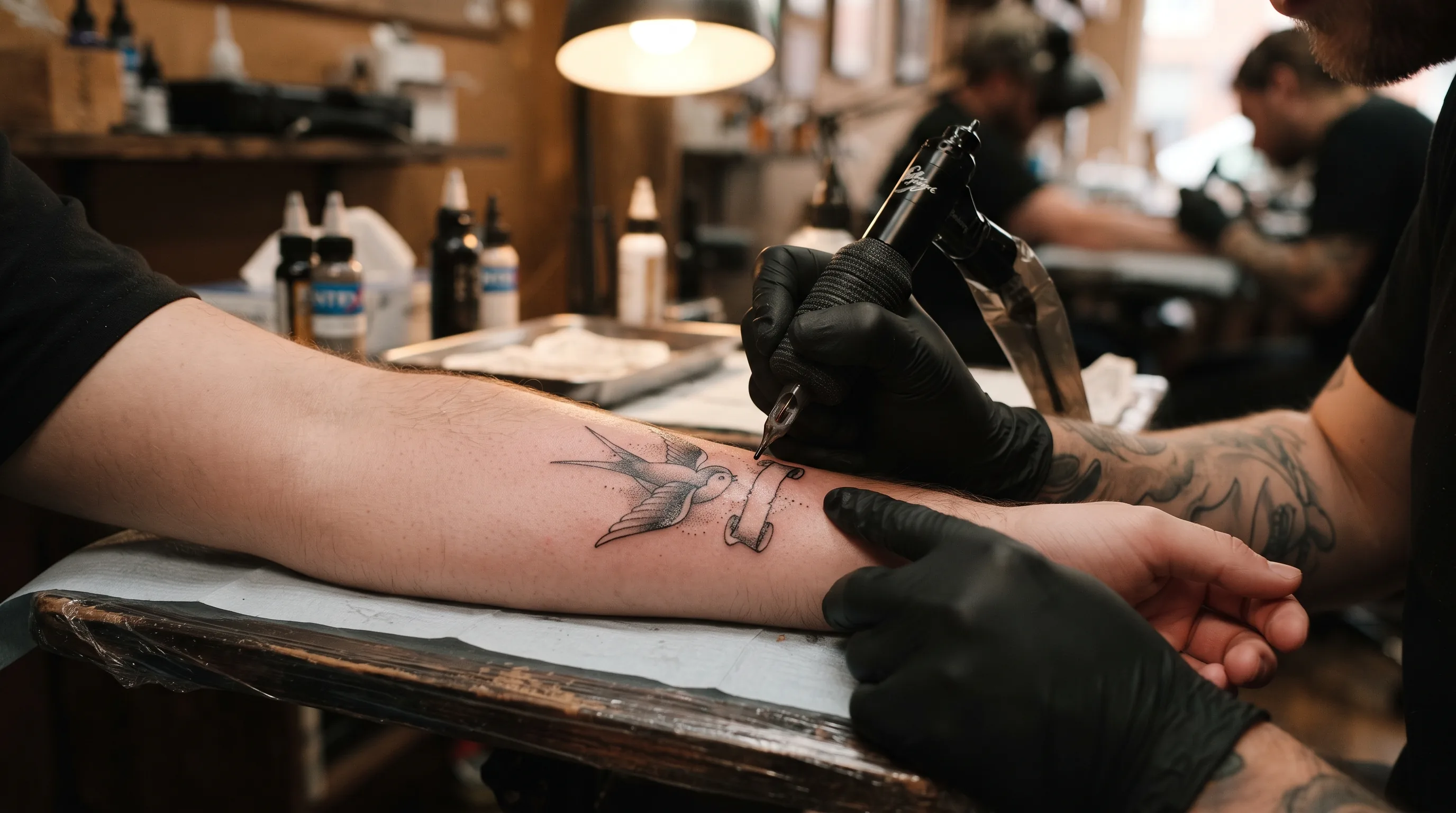
Always see the stencil placed on your body before the session begins. Check the alignment — is it level? Check the placement — is it where you want it? Check that it curves or flows the way you expected. It is far easier to adjust a stencil than a tattoo. Never let an artist skip this step for a lettering piece.
How to Find the Right Lettering Artist
Search specifically for artists who feature lettering prominently in their work. Instagram is still the most reliable place to find lettering specialists — search combinations of your city, the style you want, and terms like "script tattoo," "lettering tattoo," or "blackletter tattoo." Look for consistency across multiple examples, not just one standout piece.
When you look at their portfolio, ask yourself:
- Are the letters even and consistently spaced across the whole word?
- Does the slant stay consistent throughout a script piece?
- Are the thick and thin strokes intentional and controlled?
- Do they have healed examples, not just fresh work?
Fresh lettering always looks crisper than healed lettering. Healed photos show you the real long-term result — what the work looks like after the skin has settled and the ink has locked in. An artist who can only show you fresh work is showing you half the story.
One Final Note on Meaning
Lettering tattoos are often the most personal pieces people get — a parent's name, a date of loss, a phrase that carried someone through something hard. Because the meaning is so heavy, people sometimes rush the execution. They book the first available artist, they go too small because they want it done before they lose their nerve, they skip the stencil review because they trust it is right.
The tattoo will last a lifetime. The booking process does not need to be rushed. Take the time to find the right artist, size it properly, and proof every letter before the session starts. The things most worth keeping are worth getting right.